Here are the books that I have taken the time to create metadata and/or notes for.
An Introduction to Statistical Learning: with Applications in R
Lab 2
The Chapter 2 lab is a tour of the language itself – vectors, matrices, indexing, plotting, and loading a data set. What follows is that tour, split into the sections the book uses.
Basic Commands
Vectors are built with c() (concatenate), and both <- and = assign. Arithmetic is element-wise, so operands must share a length – reassigning x to length 3 lets it line up with y:
x <- c(1, 3, 2, 5)
x
x <- c(1, 6, 2)
y <- c(1, 4, 3)
length(x)
length(y)
x + y
[1] 1 3 2 5
[1] 3
[1] 3
[1]  2 10  5
ls() lists the objects in the workspace and rm() removes them; rm(list = ls()) clears everything:
ls()
rm(x, y)
ls()
[1] "x" "y"
character(0)
matrix() fills column-by-column unless byrow = TRUE. Functions like sqrt() and ^ apply element-wise, not as matrix operations:
x <- matrix(c(1, 2, 3, 4), nrow = 2, ncol = 2)
x
matrix(c(1, 2, 3, 4), 2, 2, byrow = TRUE)
sqrt(x)
x^2
     [,1] [,2]
[1,]    1    3
[2,]    2    4
     [,1] [,2]
[1,]    1    2
[2,]    3    4
         [,1]     [,2]
[1,] 1.000000 1.732051
[2,] 1.414214 2.000000
     [,1] [,2]
[1,]    1    9
[2,]    4   16
rnorm() draws from a normal (default mean 0, sd 1). Here y is x plus a little noise, so the two are almost perfectly correlated:
set.seed(1)
x <- rnorm(50)                        # mean 0, sd 1
y <- x + rnorm(50, mean = 50, sd = 0.1)
cor(x, y)
[1] 0.9932279
Setting a seed makes the draws reproducible. sqrt(var(y)) and sd(y) agree, as they must:
set.seed(3)
y <- rnorm(100)
mean(y)
var(y)
sqrt(var(y))                          # equals the standard deviation
sd(y)
[1] 0.01103557
[1] 0.7328675
[1] 0.8560768
[1] 0.8560768
Graphics
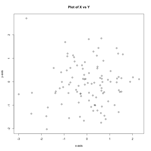
plot() is the workhorse. Labels and a title are passed as arguments:
x <- rnorm(100)
y <- rnorm(100)
plot(x, y, xlab = "x-axis", ylab = "y-axis", main = "Plot of X vs Y")
seq(a, b, length = n) makes an evenly spaced grid; 1:n is shorthand for integer sequences:
seq(1, 10)
1:10
x <- seq(-pi, pi, length = 50)
[1]  1  2  3  4  5  6  7  8  9 10
[1]  1  2  3  4  5  6  7  8  9 10
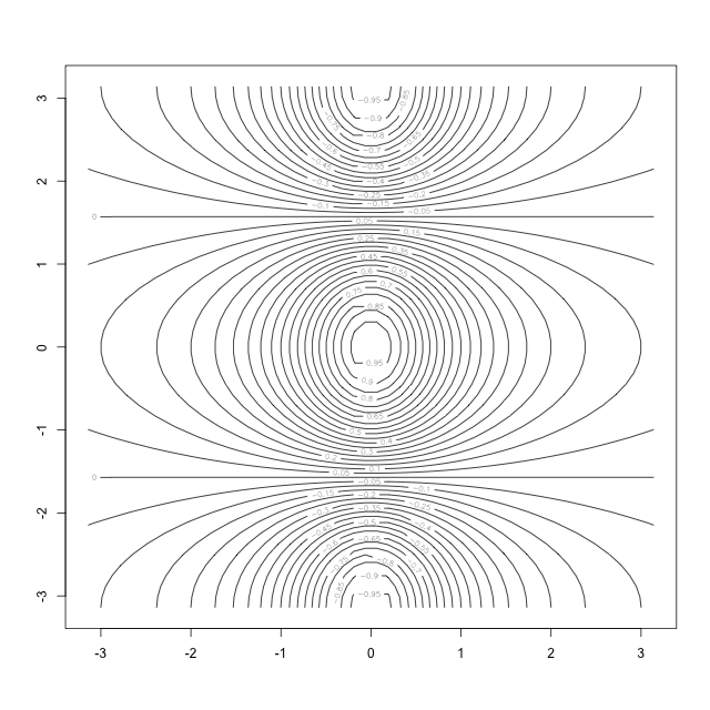
outer(x, y, f) evaluates f over every pair from the two grids, giving a surface we can draw with contour() (a topographic map of level curves):
y <- x
f <- outer(x, y, function(x, y) cos(y) / (1 + x^2))
contour(x, y, f, nlevels = 45)
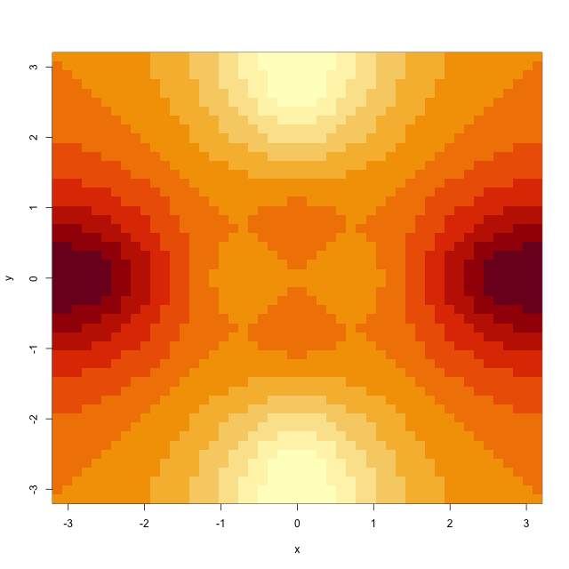
image() is a heatmap of the same kind of matrix – here the antisymmetric part fa:
fa <- (f - t(f)) / 2
image(x, y, fa)
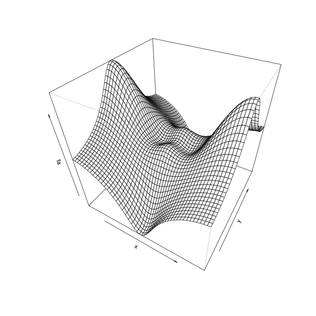
persp() draws it as a 3-D surface; theta and phi set the viewing angles:
persp(x, y, fa, theta = 30, phi = 40)
Indexing Data
Matrices are indexed A[rows, cols]. A vector like c(1, 3) picks specific rows/columns (not a range), a blank keeps every element along that axis, and a negative index keeps everything except what is named:
A <- matrix(1:16, 4, 4)
A
A[2, 3]
A[c(1, 3), c(2, 4)]                    # rows 1 & 3, cols 2 & 4 -> a 2x2 block
A[1:3, 2:4]
A[1:2, ]                               # blank = all columns
A[, 1:2]
A[-c(1, 3), ]                          # drop rows 1 & 3
dim(A)
     [,1] [,2] [,3] [,4]
[1,]    1    5    9   13
[2,]    2    6   10   14
[3,]    3    7   11   15
[4,]    4    8   12   16
[1] 10
     [,1] [,2]
[1,]    5   13
[2,]    7   15
     [,1] [,2] [,3]
[1,]    5    9   13
[2,]    6   10   14
[3,]    7   11   15
     [,1] [,2] [,3] [,4]
[1,]    1    5    9   13
[2,]    2    6   10   14
     [,1] [,2]
[1,]    1    5
[2,]    2    6
[3,]    3    7
[4,]    4    8
     [,1] [,2] [,3] [,4]
[1,]    2    6   10   14
[2,]    4    8   12   16
[1] 4 4
Loading Data
Rather than reading Auto.data from disk, the Auto data frame ships with ISLR2. na.omit() drops any rows with missing values, dim() and names() report the shape and columns, and head() previews the first rows:
library(ISLR2)
Auto <- na.omit(Auto)
dim(Auto)
names(Auto)
head(Auto)
[1] 392   9
[1] "mpg"          "cylinders"    "displacement" "horsepower"   "weight"
[6] "acceleration" "year"         "origin"       "name"
  mpg cylinders displacement horsepower weight acceleration year origin
1  18         8          307        130   3504         12.0   70      1
2  15         8          350        165   3693         11.5   70      1
3  18         8          318        150   3436         11.0   70      1
4  16         8          304        150   3433         12.0   70      1
5  17         8          302        140   3449         10.5   70      1
6  15         8          429        198   4341         10.0   70      1
                       name
1 chevrolet chevelle malibu
2         buick skylark 320
3        plymouth satellite
4             amc rebel sst
5               ford torino
6          ford galaxie 500
Additional Graphical and Numerical Summaries
attach() puts a data frame’s columns on the search path so they can be referenced by name. Coercing cylinders to a factor makes plot() draw box plots instead of a scatter; varwidth scales each box by its group size:
attach(Auto)
cylinders <- as.factor(cylinders)
plot(cylinders, mpg, col = "red", varwidth = TRUE,
     xlab = "cylinders", ylab = "MPG")
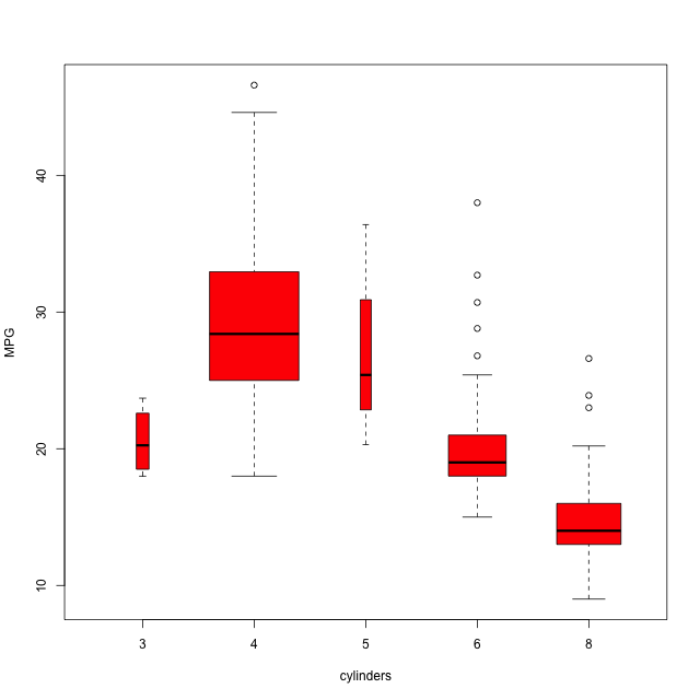
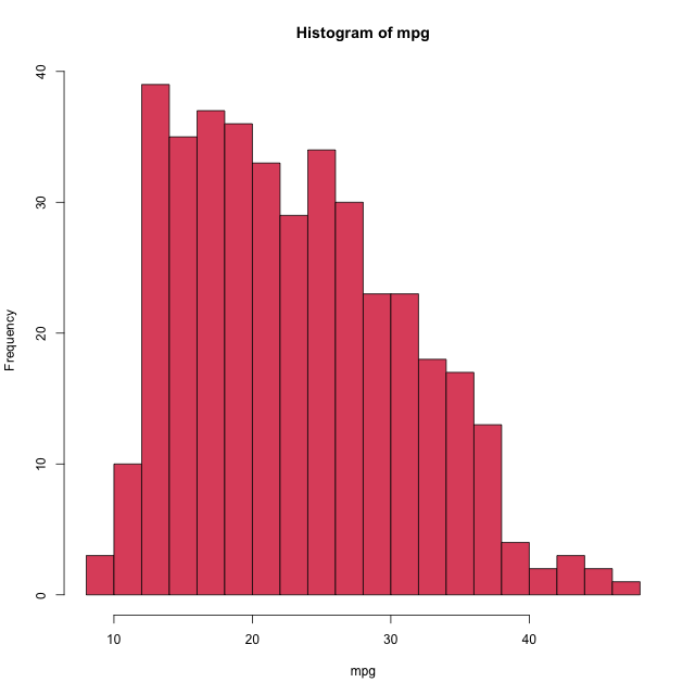
More cylinders means lower mileage. hist() shows the marginal distribution of mpg, with breaks controlling the bin count:
hist(mpg, col = 2, breaks = 15)
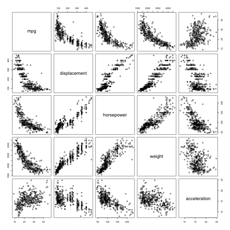
pairs() draws a scatterplot matrix; a formula restricts it to the variables of interest:
pairs(~ mpg + displacement + horsepower + weight + acceleration, data = Auto)
Finally, summary() gives a five-number-summary of each column (and a level count for the factor name), or of a single variable:
summary(Auto)
     mpg          cylinders      displacement     horsepower        weight
Min.   : 9.00   Min.   :3.000   Min.   : 68.0   Min.   : 46.0   Min.   :1613
1st Qu.:17.00   1st Qu.:4.000   1st Qu.:105.0   1st Qu.: 75.0   1st Qu.:2225
Median :22.75   Median :4.000   Median :151.0   Median : 93.5   Median :2804
Mean   :23.45   Mean   :5.472   Mean   :194.4   Mean   :104.5   Mean   :2978
3rd Qu.:29.00   3rd Qu.:8.000   3rd Qu.:275.8   3rd Qu.:126.0   3rd Qu.:3615
Max.   :46.60   Max.   :8.000   Max.   :455.0   Max.   :230.0   Max.   :5140
 acceleration        year           origin                      name
Min.   : 8.00   Min.   :70.00   Min.   :1.000   amc matador       :  5
1st Qu.:13.78   1st Qu.:73.00   1st Qu.:1.000   ford pinto        :  5
Median :15.50   Median :76.00   Median :1.000   toyota corolla    :  5
Mean   :15.54   Mean   :75.98   Mean   :1.577   amc gremlin       :  4
3rd Qu.:17.02   3rd Qu.:79.00   3rd Qu.:2.000   amc hornet        :  4
Max.   :24.80   Max.   :82.00   Max.   :3.000   chevrolet chevette:  4
                                                (Other)           :365
summary(mpg)
Min. 1st Qu.  Median    Mean 3rd Qu.    Max.
9.00   17.00   22.75   23.45   29.00   46.60
Exercise 2.10
This exercise explores the Boston housing data set from ISLR2.
a. How many rows and columns? Each row is a suburb; each column a measurement.
library(ISLR2)
dim(Boston)
[1] 506 13
There are 506 suburbs (rows) and 13 variables (columns).
b. Pairwise scatterplots of every variable:
pairs(Boston)
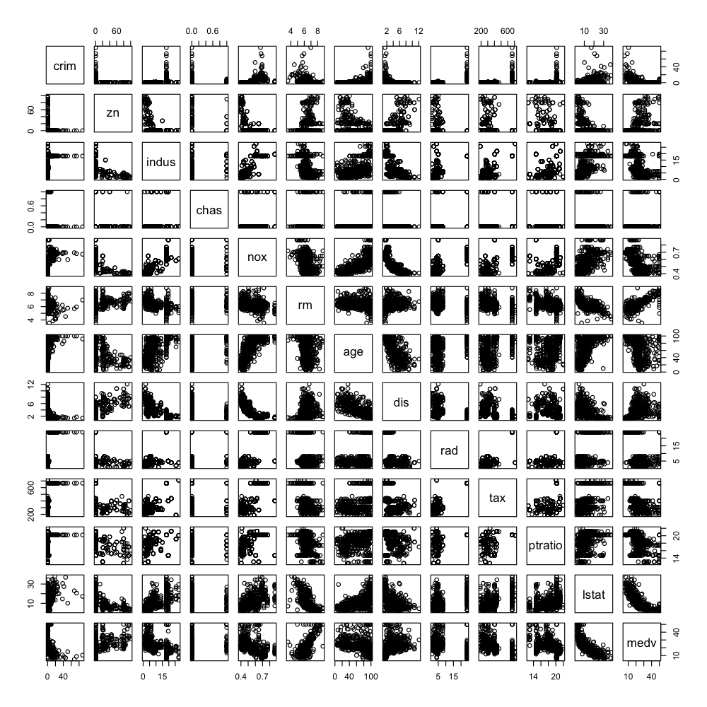
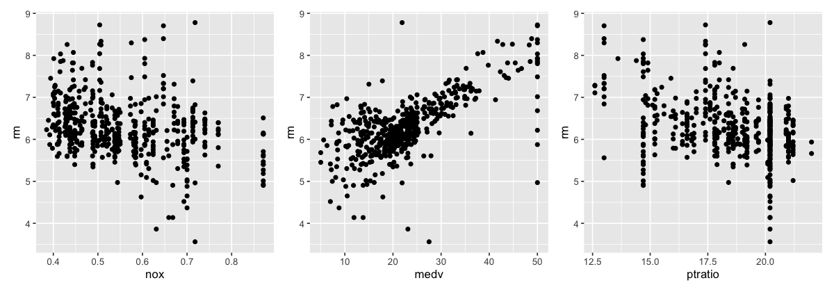
A few relationships stand out: lstat vs medv is roughly exponential, while medv and rm (average rooms) are close to linear. Plotting rm against a few predictors:
library(ggplot2)
library(tidyverse)
library(patchwork)
p1 <- ggplot(Boston, aes(nox, rm)) + geom_point()
p2 <- ggplot(Boston, aes(medv, rm)) + geom_point()
p3 <- ggplot(Boston, aes(ptratio, rm)) + geom_point() # pupil-teacher ratio
p1 + p2 + p3
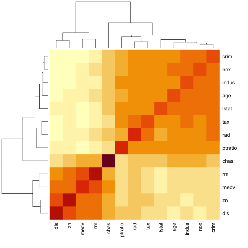
A Spearman-correlation heatmap makes the block structure easier to see:
heatmap(cor(Boston, method = "spearman"), cexRow = 1.1, cexCol = 1.1)
c. Which predictors are associated with per-capita crime rate? Ranking by Spearman correlation with crim:
round(sort(cor(Boston, method = "spearman")["crim", ]), 3)
   dis      zn    medv      rm    chas ptratio   lstat     age     rad     tax
-0.745  -0.572  -0.559  -0.309   0.042   0.465   0.635   0.704   0.728   0.729
 indus     nox    crim
 0.736   0.821   1.000
Crime rises with pollution (nox), industry (indus) and access to radial highways / property tax (rad, tax), and falls with distance to employment centres (dis) and median home value (medv).
d. Do any suburbs have particularly high crime, tax, or pupil-teacher ratios? Using a Tukey fence, \(Q_3 + 1.5 \cdot \text{IQR}\):
o2 <- quantile(Boston$crim, 0.75) + 1.5 * IQR(Boston$crim)
length(subset(Boston, Boston$crim > o2)$crim)      # crim outliers
o3 <- quantile(Boston$tax, 0.75) + 1.5 * IQR(Boston$tax)
length(subset(Boston, Boston$tax > o3)$tax)        # tax outliers
summary(Boston[c("tax", "ptratio", "crim")])
[1] 66
[1] 0
      tax           ptratio           crim
 Min.   :187.0   Min.   :12.60   Min.   : 0.00632
 1st Qu.:279.0   1st Qu.:17.40   1st Qu.: 0.08205
 Median :330.0   Median :19.05   Median : 0.25651
 Mean   :408.2   Mean   :18.46   Mean   : 3.61352
 3rd Qu.:666.0   3rd Qu.:20.20   3rd Qu.: 3.67708
 Max.   :711.0   Max.   :22.00   Max.   :88.97620
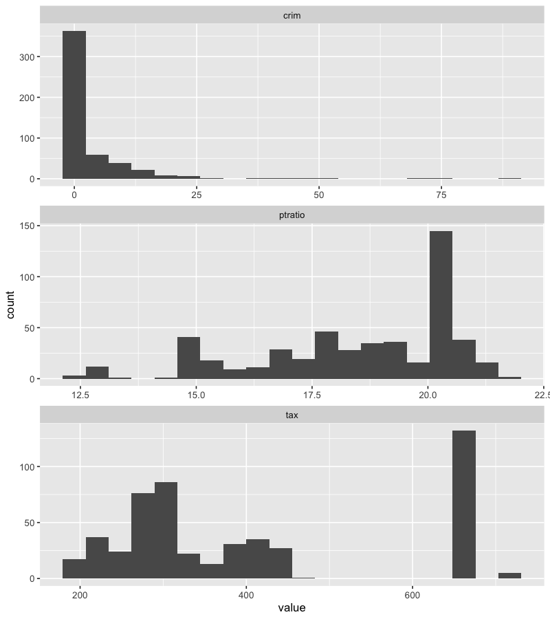
So 66 suburbs are crime outliers, but none are tax outliers by this fence – tax is bimodal rather than long-tailed. The histograms make this clear (note crim’s heavy right skew and the cluster of suburbs at the 666 high-tax level):
Boston |>
  pivot_longer(cols = 1:13) |>
  filter(name %in% c("crim", "tax", "ptratio")) |>
  ggplot(aes(value)) +
  geom_histogram(bins = 20) +
  facet_wrap(~name, scales = "free", ncol = 1)
e. How many suburbs bound the Charles River (chas = 1)?
sum(Boston$chas)
[1] 35
f. Median pupil-teacher ratio:
median(Boston$ptratio)
[1] 19.05
g. Which suburb has the lowest median home value?
Boston[Boston$medv == min(Boston$medv), ]
       crim zn indus chas   nox    rm age    dis rad tax ptratio lstat medv
399 38.3518  0  18.1    0 0.693 5.453 100 1.4896  24 666    20.2 30.59    5
406 67.9208  0  18.1    0 0.693 5.683 100 1.4254  24 666    20.2 22.98    5
Two tracts tie at medv = 5. Both are maximally old (age = 100), high-crime, high-tax suburbs – clearly among the least desirable. For context, the quantiles of every predictor:
sapply(Boston, quantile)
          crim    zn indus chas   nox     rm     age       dis rad tax ptratio  lstat   medv
0%    0.006320   0.0  0.46    0 0.385 3.5610   2.900  1.129600   1 187   12.60  1.730  5.000
25%   0.082045   0.0  5.19    0 0.449 5.8855  45.025  2.100175   4 279   17.40  6.950 17.025
50%   0.256510   0.0  9.69    0 0.538 6.2085  77.500  3.207450   5 330   19.05 11.360 21.200
75%   3.677083  12.5 18.10    0 0.624 6.6235  94.075  5.188425  24 666   20.20 16.955 25.000
100% 88.976200 100.0 27.74    1 0.871 8.7800 100.000 12.126500  24 711   22.00 37.970 50.000
Against these quantiles both suburbs sit at the maximum crim, tax and age, and the minimum medv – confirming they are genuine low-end outliers rather than merely below-average.
h. How many suburbs average more than seven / eight rooms per dwelling?
length(Boston[Boston$rm > 7, ]$rm)
length(Boston[Boston$rm > 8, ]$rm)
[1] 64
[1] 13
Of the 13 suburbs with rm > 8, almost all have very low crime and below-median lstat – these are the affluent, spacious tracts.